User First: 7 Website Usability Best Practices to Increase Engagement

simon • 23 April 2025

Discover 7 website usability best practices, quick wins and testing tips to increase engagement, dwell time and conversions.

Dark UX landing page mockup with glowing phone screen and blue interface cards on a black background

Putting people before pixels
You can pour thousands into Google Ads, stuff your pages with the choicest keywords and fire newsletters at inboxes like confetti at a June wedding – but if visitors land on a clunky site, they’ll bounce faster than you can say “404”. That’s why website usability best practices belong at the very top of your digital to‑do list. Nail them and you’ll enjoy longer sessions, lower bounce rates and a steady flow of enquiries. Ignore them and, well, even Batman will struggle to save your conversion stats.
Below are seven field‑tested tactics – a mixture of website usability quick wins and longer‑term strategies – to turn casual clickers into engaged superfans.

Smartphone showing a Wi‑Fi speed test with colorful bars beside a laptop keyboard

1. Speed is your super‑power
Why it matters
Every additional second of load time can slash conversions by up to 20 %. People expect pages to appear quicker than a cuppa in a builder’s mug; keep them waiting and they’ll hoof it back to Google. Quick wins
  • Compress images – modern formats (WebP/AVIF) can halve file size without the potato‑quality fuzz.
  • Cache like you mean it – server‑side caching and a sensible CDN mean repeated visits feel instant.
  • Trim the bloat – axe unused plug‑ins, minify CSS/JS, and politely show the exit to that 7‑MB hero video autoplaying above the fold.

Hero tip: Our Website Audit tool benchmarks load speed in seconds, not minutes. It’s free – and marginally less painful than yet another page‑speed lecture from the dev team. 

Man standing with a phone in a room of many glowing digital screens and displays

2. Mobile‑first, not mobile‑last
Google’s been indexing mobile versions first since 2019. Yet we still see gorgeous desktop layouts that transform into finger‑pinch nightmares on phones.
  • Stick to a single‑column layout under 768 px.
  • Use at least 16 px body text, 44 px tappable targets.
  • Stop hiding vital content behind tiny hamburger menus – nobody likes a treasure hunt.

These tweaks aren’t glam, but they’re usability best practices for higher dwell time on the small screen, where over 60 % of browsing now happens. 

Dark UI icon set showing menu, list, and filter symbols in white on black background

3. Navigation: show, don’t maze
Ever wandered into an Ikea, lost your bearings and wondered if you’ll see daylight again? That’s how users feel inside labyrinthine menus.
  • Keep primary nav to 5–7 items ; anything more, pop into a “More” dropdown or the footer.
  • Breadcrumbs help visitors backtrack without the browser’s back button.
  • Label things plainly: “Pricing” trumps “Money Matters”. Wit is welcome, but clarity pays the bills. 

Modern desk with computer showing web design mockups and floating UI website layouts

4. Above‑the‑fold clarity
First impressions form in 50 milliseconds – roughly the time it takes to register that the hero image is, in fact, a stock photo of two professionals laughing at salad.
Above the fold, answer three questions:
  1. What is this?  – your H1.
  2. Why should I care?  – a sharp, benefit‑led sub‑heading.
  3. What now?  – a single, contrasting call‑to‑action button.

Users decide whether to scroll based on this snippet alone. Get it right and watch engagement soar. 

Purple neon website hero banner reading “Need Affordable and Effective Digital Marketing?” with a caped figure, laptop, and cityscape

5. Accessibility: heroics for every visitor
Fourteen per cent of UK adults live with some form of disability. Accessibility isn’t a favour – it’s the law (WCAG 2.2, anyone?) and fantastic for SEO.
  • Maintain a 4.5:1 colour contrast ratio for text.
  • Use clear focus indicators so keyboard users can see where they are.
  • Alt‑text isn’t just for Google Images; it’s for those using screen‑readers, too.

Accessible design doesn’t dilute creativity; it sharpens it. Inclusive sites keep visitors around longer – another tick in the “higher dwell time” column. Have a play with UserWay, our method for keeping all our client websites compliant and easy to navigate for those with a disability. Just click the icon in the bottom left corner of the screen.

Desk setup with monitor showing a pink-themed collage, lit by purple ambient light

6. Microcopy that guides (and sells)
Those little snippets of text – button labels, form hints, error messages – do heavy lifting for usability. They reassure, clarify and nudge.
  • Swap “Submit” for “Get my free quote”, “Sign up” for “Start my 14‑day trial”.
  • Turn error messages into helpful detours: “Password too short – use 8+ characters and a heroic symbol ⚡.”
  • In forms, explain why you need info (“We’ll only use your number to confirm your booking – scouts’ honour”).

Small words; mighty impact on conversions.

Glasses on a desk in front of a computer screen with code and colorful interface windows

7. Test, measure, refine
Even the Hulk wouldn’t rely on hunches alone. That’s why usability testing for higher conversions is our final (and most important) practice.
Guerilla usability tests
Grab five real users – a mate, your mum, Barry from Accounts – and watch them complete key tasks. You’ll spot sticking points within minutes.
Analytics deep dive
Heat‑maps and session replays reveal rage clicks and dead ends. If users bounce on step two of your checkout, you know where to wield the UX chainsaw.
A/B experiments
Change one element at a time: heading, hero image, CTA colour. Measure. Keep the winner. Repeat. Continuous testing transforms website usability quick wins into sustained revenue growth – and it’s the only way to prove those tweaks equal pounds, not just prettier wireframes.

Person typing code on a laptop in a neon-lit workspace with blurred code on screen

Bringing it all together
Great usability is invisible: pages load before you blink, buttons sit exactly where you expect, and the journey from homepage to “Thanks for your order” feels friction‑free. Get these seven practices right and you’ll enjoy:
  • Longer sessions and higher dwell time
  • More conversions at a lower cost per acquisition
  • Happier humans who’ll recommend you faster than you can say “nice UX”

Need a hand turning theory into tangible results? Our Website Design service bakes every best practice into sites that look sharp and sell harder. Or run your current site through our free audit for a personalised punch‑list of improvements.
Ready to level‑up your website? Book a discovery call and our heroes will map out your next quick win – cape, caffeine and conversion rates at the ready. Schedule a chat today. 

Share this article

Recent Posts

Blue marketing banner with cartoon character and text: “What a Marketing Manager Wishes They Could Tell You”
by Simon Edward 9 June 2026
How to Support a Stretched Marketing Manager Without Hiring | My Digital Hero
Dark blue marketing graphic with a caped hero and laptop; text reads “The Real Cost of Doing Your Own Marketing.”
by Simon Edward 1 June 2026
You are not saving money by doing your own marketing. You are hiding the cost from yourself. Here is the real maths, plus a free tool that scores your marketing out of 100.
SEO explainer graphic with Google search bar, upward arrows, and a cartoon robot on a blue background
by Simon Edward 25 April 2026
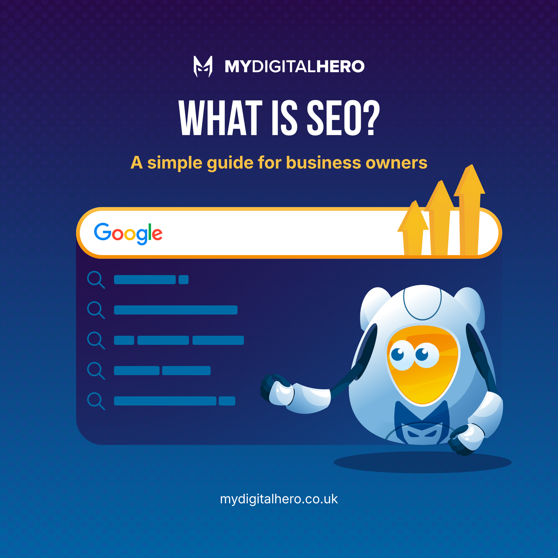
Understand SEO & its impact on your business. Get key strategies for success. Contact My Digital Hero for expert support!
Tech Stack Graveyard poster with a blue robot among tombstones on a purple night background
by Simon Edward 25 April 2026
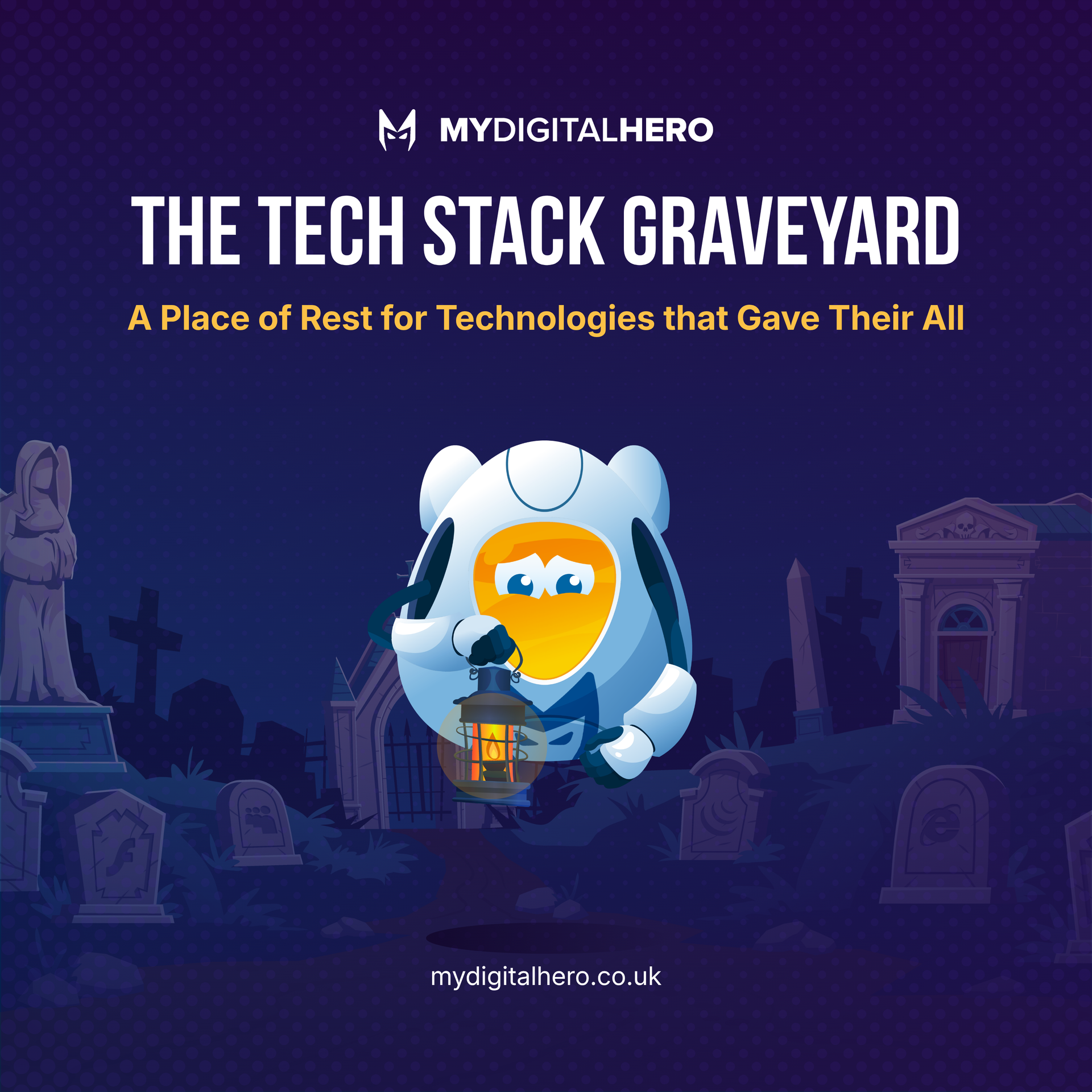
Explore our interactive graveyard for dead tech like Adobe Flash & Internet Explorer. Join us in remembering the tech that shaped the web!
Infographic comparing native app, web app, and website with colorful circles and a cartoon robot mascot
by Simon Edward 25 April 2026
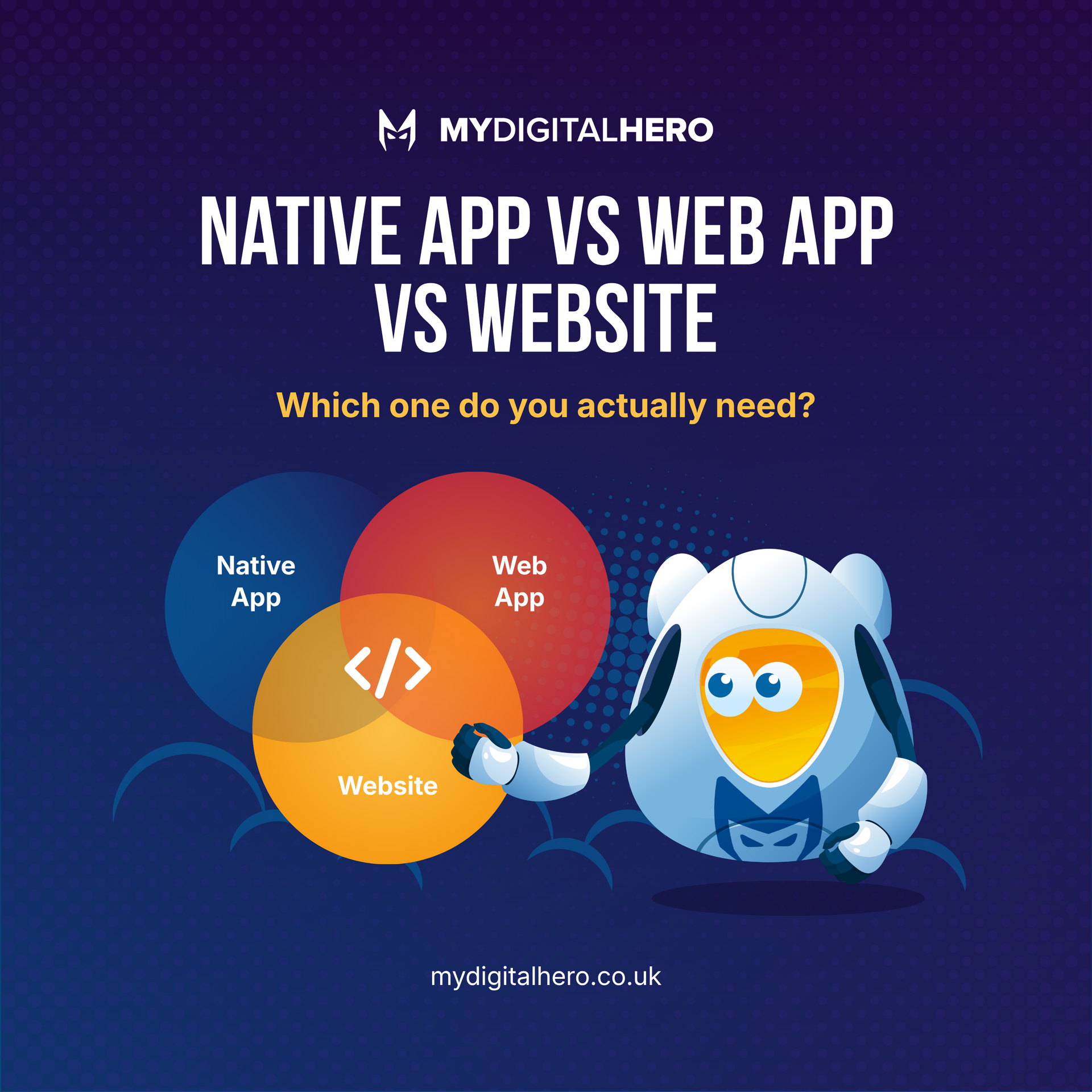
Understand the differences between native apps, web apps & websites. Choose the right solution for your business needs today!
Blue infographic with a cartoon owl and six coin icons, titled “The 6 Types of Business Owner We Meet.”
25 April 2026
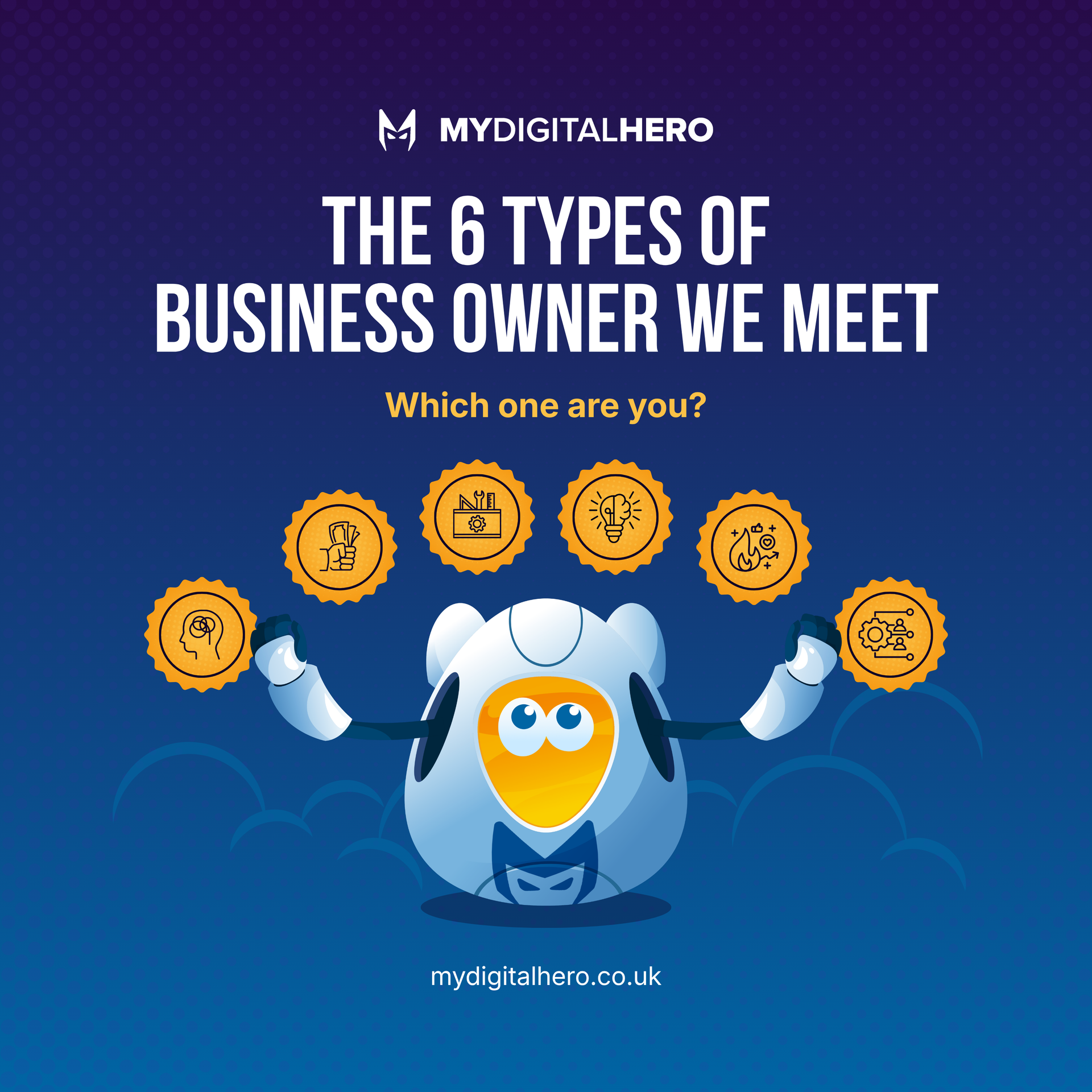
Identify 6 business owner types & discover how a marketing partner can boost your growth. Contact us for tailored solutions!